
A countertop sample rarely looks confusing on its own. The confusion starts when you hold it next to cabinet paint, flooring, backsplash tile, and the light in your kitchen at 8 a.m. versus 6 p.m. That is why kitchen countertop color trends matter less as isolated swatches and more as part of a full-room decision.
For homeowners and design professionals, the real question is not simply what is trending. It is which colors will still feel grounded, polished, and appropriate once the project is built, lived in, and cleaned every day. The strongest choices right now are less about chasing novelty and more about creating depth, warmth, and visual balance with materials that perform.
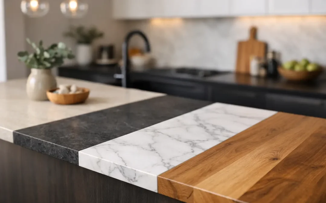
Kitchen countertop color trends are getting warmer
After years of crisp bright whites and cool grays, the market has shifted toward warmer, quieter tones. That does not mean every kitchen is turning beige. It means the most successful surfaces now carry a bit more softness – creamy whites, taupe-inflected neutrals, sand tones, warm greige, and layered stone patterns that feel more natural than stark.
This shift makes sense in real homes. Warmer countertop colors tend to work better with white oak cabinetry, natural wood flooring, mixed metals, and the softer paint palettes many homeowners are choosing. They also photograph well without feeling flat in person.
For natural stone and engineered surfaces alike, warmth is showing up in subtle ways. A white background may have ivory movement instead of blue-gray. A gray slab may lean mushroom instead of steel. Even darker materials often carry brown, bronze, or charcoal undertones rather than pure black.
Soft whites still lead, but not the icy kind
White countertops remain one of the most requested looks for kitchens, especially in renovation projects where clients want brightness and resale appeal. What has changed is the tone of white being selected. The cleaner, colder whites that dominated for years are giving way to whites with a little cream, bone, or parchment in the base.
This matters because cabinets, walls, and backsplashes rarely share the exact same white. A softer countertop color is often more forgiving when layered with painted cabinetry and warmer finishes. It can also make a kitchen feel more relaxed and less clinical.
Marble looks, light quartzites, and quartz surfaces with understated movement all fit here. The key distinction is restraint. Instead of a plain bright white slab with almost no variation, many clients now prefer a surface with depth – soft veining, tonal clouding, or natural shifts that give the kitchen character without overwhelming it.
Beige, taupe, and sand are back – in a better way
For many people, beige still carries baggage from older interiors. But the current version is much more refined. Today’s warm neutrals are cleaner, more architectural, and often paired with better materials throughout the room.
A taupe or sand-toned countertop can be especially effective in kitchens that need warmth but do not want heavy contrast. It works well with white oak, walnut, painted cabinets in mushroom or putty tones, and backsplashes that lean handmade or textured. In large kitchens, these hues can help expansive island surfaces feel calm rather than cold.
There is a practical advantage too. Mid-tone neutrals tend to hide day-to-day dust, crumbs, and water spotting better than very dark or very bright polished surfaces. That does not mean they are maintenance-free, but they often feel easier to live with.
Dramatic veining is staying, but the palette is more controlled
Bold movement is still very much in demand, particularly for islands and statement kitchens. The difference is that many homeowners are becoming more selective about how that drama shows up. Instead of choosing the busiest slab in the room, they are looking for strong veining with a more disciplined color story.
That might mean a warm white background with sweeping gray-brown veins, a quartzite with layered mineral movement, or a marble-inspired surface where the pattern creates impact without introducing too many competing colors. This is especially useful in open-plan homes, where the kitchen needs presence but also has to relate to adjacent living areas.
For designers and builders, this is where slab selection becomes critical. A dramatic countertop can be extraordinary, but only if the scale of the movement suits the cabinetry layout and the room’s architecture. Large islands often support stronger patterning. Smaller kitchens usually benefit from quieter movement or more tonal consistency.
Earthy greens, charcoal, and deep moody tones are growing
Not every kitchen is moving lighter. Dark countertops continue to have a place, especially in projects aiming for contrast, sophistication, or a more tailored look. What is changing is the tone within those darker selections.
Pure black still works in the right setting, but charcoal, deep olive, green-black, and brown-black hues feel more current. These colors pair especially well with stained wood cabinets, brushed brass, aged bronze, and textured finishes. They can also make a waterfall island feel sculptural rather than stark.
The trade-off is visibility. Dark polished surfaces may show fingerprints, dust, and water marks more readily, especially under strong task lighting. Honed or leathered finishes can soften that effect, depending on the material. This is where honest material guidance matters, because color and finish need to be evaluated together.
The undertone is often more important than the color name
One reason countertop decisions go wrong is that people shop by broad color category alone. White, gray, beige, and black are too general to be useful without considering undertone. A countertop that looks warm in the showroom may read pink next to certain cabinets. A gray that seems neutral on a sample can turn blue in a north-facing kitchen.
When evaluating kitchen countertop color trends, undertone should lead the conversation. Is the slab warm, cool, or truly balanced? Does the veining pull gold, taupe, green, charcoal, or blue? How will that interact with floor stain, cabinet color, and backsplash material?
This is also where natural stone offers a different design experience. With granite, marble, quartzite, and other specialty stones, the variation is part of the appeal. No two slabs are exactly alike, so the final selection should happen in person whenever possible. A curated showroom experience helps clients compare full slabs, not just small chips, and make a more confident call.
Matching trends to the right material
The color trend may catch your eye, but the material determines how that look performs. A soft white marble is beautiful, but it is not the same decision as a soft white quartzite or quartz. A dark granite behaves differently from a dark engineered surface. Veining, porosity, etching risk, maintenance expectations, and finish options all affect whether a color trend is right for your kitchen.
For busy households, a warm white or greige quartz may offer the look people want with simpler upkeep. For clients who value natural movement and authenticity above all, quartzite or granite may be the better fit. For baking-focused kitchens, marble still has a place, but it requires clear expectations.
There is no single best choice. There is only the best fit for how the kitchen will be used, how much contrast you want, and how comfortable you are with the maintenance profile of the surface.
How to choose a trend that will age well
The safest approach is not to avoid trends altogether. It is to separate short-term fashion from lasting design direction. Warmth is likely to have staying power because it responds to broader shifts in interiors and architecture. Natural movement also tends to age better than overly artificial patterning.
If you want a countertop that still feels right years from now, keep the fixed elements in mind. Flooring, cabinet style, and natural light usually influence the result more than trend forecasting. A slab should support the room, not compete with every other finish.
At Stonhaus Design, we often see the best results when clients narrow their choices based on three things: the room’s light, the cabinet color, and the level of visual movement they want to live with every day. That sounds simple, but it prevents many expensive mistakes.
What these kitchen countertop color trends mean for your project
The strongest kitchen countertop color trends right now point toward warmth, authenticity, and better coordination across the whole room. Soft whites are replacing icy ones. Taupe and sand are returning in more elevated forms. Dramatic veining remains relevant, but with more restraint. Dark surfaces are still compelling, especially when they lean earthy rather than flat black.
The right countertop color should do more than look current. It should make the kitchen feel considered, support the cabinetry and lighting, and hold up to real use. If you evaluate color in the context of material, finish, and the full palette around it, the decision becomes much clearer.
A good slab does not need to shout to feel special. Often, the most lasting choice is the one that looks right from every angle, in every light, and still feels like your kitchen once the trend cycle moves on.